How to Build a Component Library with Angular and Storybook
By visualizing your UI component library both developers and designers become more productive

In this article, I first describe how to build a component library with Angular CLI. After the library is done, I write some stories in Storybook to test and document the UI components.
Storybook is a UI component explorer that visualizes components in different states. Storybook enables structured UI development, testing, and documentation for the major JavaScript frameworks.

Before we start
I have a habit of using short hands of script commands and flags so here are a some that I might use in this article:
npm install -> npm i
ng test -> ng t
ng generate ->  ng g
ng generate library -> ng g lib
Component Library
The goal is to have a component library that we can explore with Storybook. For this, I’m creating a library with a button component.
Workspace
The Angular CLI is constantly getting better and the functionality I’m using here came with versions six and seven of Angular.
Make sure you have Angular CLI installed globally with:
npm i -g @angular/cli@7
To begin with I’m going to create an empty workspace called ng-ui.
I don’t want to have an application and for that the --createApplication flag is used with the ng new command. Setting this to false creates an empty workspace with no initial app.
ng new ng-ui --createApplication=false
For deeper knowledge in this topic read this great article by Todd Palmer:
Libraries
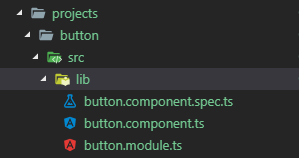
Now let’s create a component. Since each component is a library we can create one called button. Documentation for generate library.
ng g lib button -p ui
This creates the projects/button folder in your workspace, which contains a component and a service inside an NgModule. We don’t need the service so we can delete its files.
The workspace configuration file, angular.json, is updated with a project of type library.
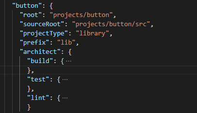
As we can see, the architect has build, test, and lint so we can then use those commands.
ng build button
ng test button
ng lint button
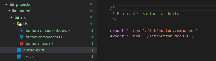
The public API for your library is maintained in the public-api.ts file in your library folder. Anything exported from this file is made public when your library is imported into an application. Use an NgModule to expose services and components.
If you are using an older CLI you might have snake_case instead of kebab-case for this file: public_api.ts
I have written two articles that go more into detail about creating libraries, adding useful things to them, and using them in other projects:
Button
Let’s change the code of the button component to have two input properties: text and disabled.
import { Component, Input } from '@angular/core';

@Component({
  selector: 'lib-button',
  template: `
    <button [disabled]="disabled">{{text}}</button>
  `
})
export class ButtonComponent {
  @Input() text: string;
  @Input() disabled: boolean;
}
Now we can build the button library.
ng build button
And now let’s also pack it so we can install it in other projects. For this, I’m going to pack it to a tarball. Since we need to be in the button directory when we run npm pack we can create a script for it.
"scripts": {
  ...
  "pack_button": "cd dist/button && npm pack",
  ...
}
Now we can use npm run pack_button to get a tarball called button-0.0.1.tgz.
Or if you want to publish it to a repository use npm publish instead of pack.
For deeper knowledge on building and packaging you can read this great article by Todd Palmer:
If you are into scripting and automation like I am then you can read this article where I explain how to automate your process with multiple libraries.
Let’s see how we can use our button component in Storybook next.
Like this blog post? Share it on Twitter! 🐦

Storybook is an environment for defining, developing, and testing UI components. It started as react-storybook but it is now open for other frameworks as well. Storybook is open source with a strong community behind it. Hundreds of contributors, tens of thousands of stars on GitHub, and millions of monthly downloads ensures a bright future.
It’s open source and totally free to use.
Setup
Now, let’s add Storybook to our project. It comes with a CLI tool that makes it really easy to add so let’s use it to initialize our project to a storybook project. Here I use npx so I don’t have to install it globally.
npx @storybook/cli init
It detects that our project is an Angular project and sets things up accordingly.

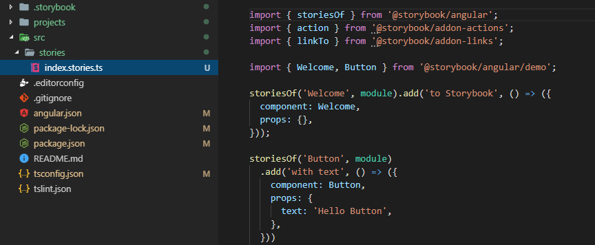
All the necessary configurations, devDependencies, and npm scripts are added to our project. It also created src/stories/index.stories.ts with example stories.
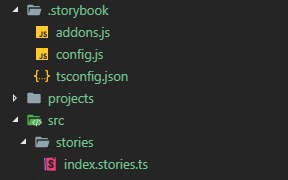
Since we didn’t have an application in our workspace we have to change the path to the TypeScript configuration file in storybook/tsconfig.json so that it instead extends the one in the root folder.
"extends": "../tsconfig.json"
Startup
We can now run storybook.
npm run storybook
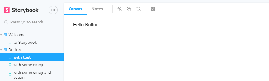
This will start a local webpack server on port 6006 and you can visit the generated storybook by going to http://localhost:6006/. What you’ll see is an example Storybook that was generated from an index.stories.ts file under a stories folder at the root of the project.
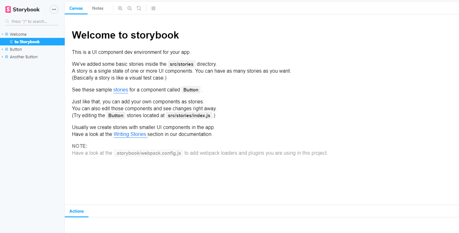
You can see the generated sample stories in /stories/index.stories.ts.
There are two levels to the tree structure of Storybook. The component is defined by storiesOf and we use add for showing different views of it. You can add as many stories per component as you need.
And we can click to the corresponding button in the Storybook tree view.
Let’s delete these examples and create a story for the button we created in our library. To be able to use it we must first install it from the tarball we created.
Integration
We want to use the button library in our application so we use npm install like this:
npm i dist/button/button-0.0.1.tgz
Now if we open package.json we should see that the library is added to the dependencies.
"button": "file:dist/button/button-0.0.1.tgz"
If you instead published it to a repository you can install it as normal.
npm i button
Stories
Storybook is all about writing stories. A story usually contains a single state of one component, almost like a visual test case.
Let’s add a couple of stories to our button component. We have two input properties that we can test. For the first story, we send in ‘hello’ to the text property and get a normal button with hello written on it.
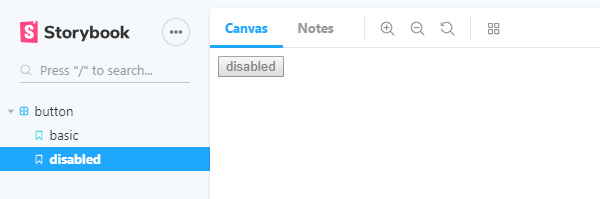
For the second story, we send in true to the disabled property and get a disabled button in the Storybook.
import { storiesOf } from '@storybook/angular';
import { ButtonComponent } from 'lib-button';

storiesOf('button', module)
  .add('basic', () => ({
    component: ButtonComponent,
    props: {
      text: 'hello'
    }
  }))
  .add('disabled', () => ({
    component: ButtonComponent,
    props: {
      text: 'disabled',
      disabled: true
    }
  }));
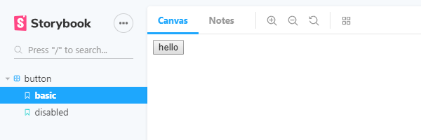
By adding stories for all permutations of the properties of the component we get visual tests for each use-case. We can test and play with our component in an isolated environment. And this also enables designers to work on styling the components that are used in the application.
Conclusion
We’ve seen how and why you should consider using Storybook with Angular. By visualizing your UI component library, Storybook can help both developers and designers become more productive. And by writing stories we can also test all use-cases of the components.
And since it is open source and free to use there is no excuse to at least give it a try!
When you are done and it’s time to release the libraries: Release management in Angular with Lerna Automate component library releases through commit conventionsmedium.com
Call to Action
I always enjoy feedback so please 👏, 📝 and tweet 🐦. Follow me on Twitter and Medium for blog updates.